


Introduction
In this blogpost we are taking a look at humanitarian mapping through the Tasking Manager (HOT-TM) that is operated by the Humanitarian OpenStreetMap Team (HOT). At HeiGIT we work together with HOT to provide analyses and statistics to further understand mapping activity. Explore the user and mapping stats of all Tasking Manager activites here. Check our blog posts about topics concerning this data and our collaboration with HOT.
To understand the following analysis, first off a short introduction: Different (humanitarian) organizations create projects in the HOT-TM. Often, these projects focus on selected countries, which are at a higher risk for disasters to happen. A OSM mapper can voluntarily work on one of these HOT-TM projects. In this case the mapper would be considered a “HOT-TM user” for our analysis. Since we are looking at the activity of these users, an active user has to have edited OSM in the last three months. It is important to acknowledge that the user activity does not resemble the amount of user contributions nor the cumulative number of users per country. All these are other information that are used in differentcontexts. (If you are interested in the details check here.) The timeframe that we are considering is from January 2010 to October 2022.
Now that the base is set, on to the data!
Importance
How is the mapping with the HOT-TM distributed around the globe? We created a world map with the amount of total TM-Users contributing to projects in a country to see, for which countries the tool is the used by a significant number of mappers.
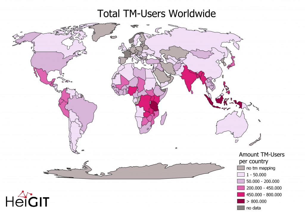
We can see, that the countries with the most TM-Users are located in central and eastern Africa and South-East Asia. To a large extend these countries align with the HOT “priority” countries. In Europe, North America and Australia on the other hand there is (as expected) none to very little HOT-TM mapping.
User activity
Now that we know where there is a lot of mapping through the HOT-TM, we want to find out more about how this activity varies over time.
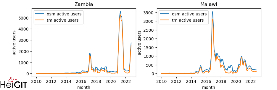
First, let’s look into the priority countries that have the highest share of active HOT-TM users among all active OSM users . The top ten is: Zambia, Guatemala, Jamaica, Botswana, Malawi, South Sudan, Nigeria, Dem. Rep. Congo, Tanzania, Chad, with shares from up to 77,3% active HOT-TM users of all active OSM users. We therefore can see that HOT-TM mapping is an important part, if not the biggest influence and driver of mapping buildings and roads in OSM in these countries.
As a showcase, here are two of these countries in the figure below. You can check these and other countries on the humstats website and find out more about user activity, cumulative number of users or the number of buildings mapped. There it is even possible to download the data and work with it on your own.
Organizations
To better understand and explain the peaks in user activity per country, we now look at different organizations and their contributions to OSM. These organizations contribute indirectly through the creation of projects in HOT-TM, but it’s still the mappers that do the job in the end.
We focus on the more recent data from January 2020 to October 2022 to cover the time frame since the outbreak of COVID-19. Furthermore, to ensure a clear overview, only those organizations, that contributed a lot in this time range are featured in the plot. We chose six countries, that have a high HOT-TM user activity.
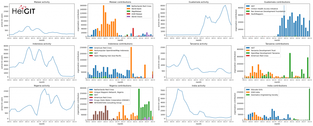
But what does this tell us? On the left side each country we have the active HOT-TM users over time, while on the right side we have the active organizations with OSM contributions related to their HOT-TM projects. While it does not line up perfectly we can see that when there are many contributions, there often is a peak in the HOT-TM user activity visible as well. The reasons for the peaks not lining up might be because there can be situations where few mappers contribute a lot in a short time. This leads to peaks in the contributions but not in the user activity.
Another interesting thing we learn is the constellation of organizations. There is rarely more than one organization with high contributions, in each month there is a dominant one. If that’s not the case, like in Tanzania, there is a peak in user activity in the months where two or more organizations contribute.
We can also learn about who issues projects: There are country-specific organizations (like MapMalawi, OSM India) and international organizations (American Red Cross, HOT, World Bank) alike.
What we cannot learn from this data are external reasons for peaks. Was there a natural disaster that caused many organizations to issue tasks like mapping hospitals? Or did a country want to improve their maps and issued the mapping of roads and buildings?
These could be further topics to analyze. Stay tuned for more blogposts about these datasets!
Background Information
The aim of the ohsome OpenStreetMap History Data Analytics Platform is to make OpenStreetMap’s full-history data more easily accessible for various kinds of OSM data analytics tasks, such as data quality analysis, on a regional, country-wide, or global scale. The ohsome API is one of its components, providing free and easy access to some of the functionalities of the ohsome platform via HTTP requests. Some intro can be found here:
- ohsome general idea
- ohsome general architecture