

After introducing the OSM Element Vectorisation Tool last week, we now want to show possible use cases and specific examples of what the tool can do. This second of three use cases (see use case 1) compares the data in the regions of Maribor, Slovenia and Ngaoundéré, Cameroon. Both regions are exceptionally well covered with land-use and land-cover information in OSM. This is due to the imports that occurred in both regions: the RABA-KGZ-import from official data in Slovenia and the import from classified satellite images in Cameroon. In fact, we only assume the latter was an import. Unfortunately, it did not undergo the normal import procedure and was not documented. Please visit the repository for detailed information.
Data
To reproduce this use case, first download the two examples maribor and ngaoudere and convert them to GeoPackages (see the README). Otherwise, just scroll along. For an overview of the exact implementation for the different data aspects, please refer to the documentation.
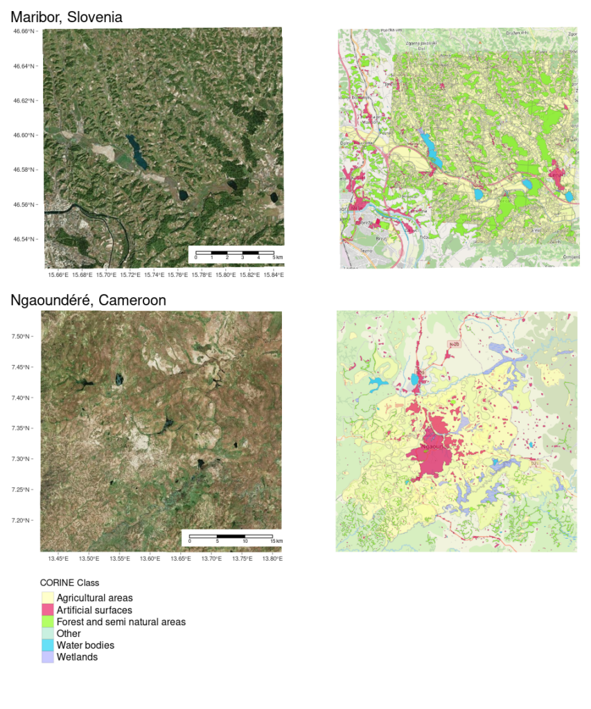
The two datasets represent a snapshot of the data on the first of January 2022. As a human, we can see that the data in these two regions is different; different beyond the ‘real world’/landscape differences that a southern European and a central African region have (see scale bar). But can we quantify it so a machine can understand it?
Analyses
The two regions differ substantially in size both geographically and with respect to the amount of OSM data. Nevertheless, the samples are sufficiently large, that a comparison is reasonable:
| region | element_count |
|---|---|
| Maribor | 13188 |
| Ngaoundéré | 1736 |
Interestingly the larger area of Ngaoundéré contains less objects compared to Maribor while having a ‘comparable’ coverage. So we automatically expect larger elements in this area. But lets look at the numbers.
Statistics
Using statistical tests, it can be analysed whether the two datasets differ significantly.
Object Size
Let’s see if the objects in Cameroon are significantly larger than the ones in Slovenia:
##
## Wilcoxon rank sum test with continuity correction
##
## data: raw_indicator.obj_size by region
## W = 6113175, p-value <2e-16
## alternative hypothesis: true location shift is less than 0
There is a highly significant difference between the two regions. But is a statistical test the right thing to do here? If we wanted to compare Slovenia to Cameroon, it would be, but in that case we would need a somehow random sample. These two samples are everything but random. Instead the sample features all elements in arbitrary areas around Maribor and Ngaoundéré. So its rather a comparison between these two locations. But in that case its no longer a sample, its the population1. So let’s approach this differently.
Visual Comparison
Geometrical Attributes
In addition to the element size we will add other geometrical attributes to get a more multi-faceted overview of this aspect. Namely we will add the coarseness which is the mean edge length and the complexity, which is an index value.
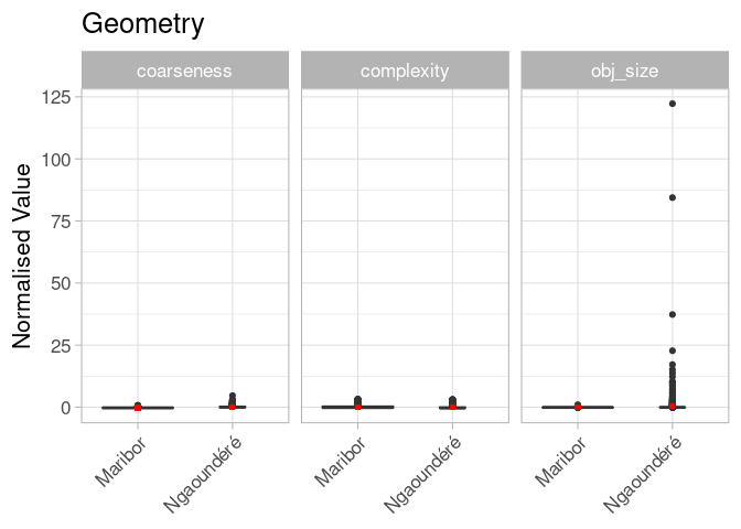
This method didn’t go as planned. What happened is that we used the normalised indicators provided by the tool. The problem is that normalisation (or scaling) takes place on a predefined set of 1’000 random global objects. And this does not seem to fit well in our case. So what we can say is that there are some large elements in Ngoundéré, even on a global scale. Having values that relate our element attributes to the global OSM land-use and land-cover dataset is nice, but we prefer readable graphs.
We can either re-scale the data or use the original/raw values and accept that the y-axis will have different ranges for the three variables. The scaling has no impact on the above statistical analyses because that works on ranks, which are preserved when doing a linear shift of the data to a new scale.
Let’s try the raw data, because we don’t need to compare our dataset to other datasets (yet):
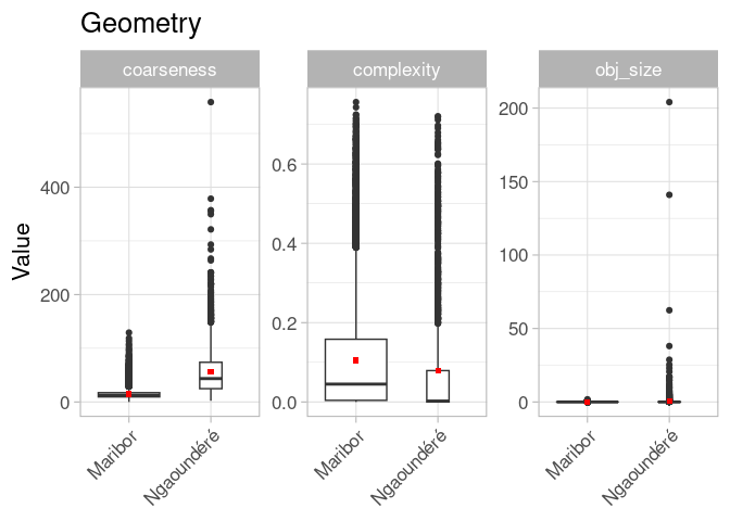
OK, better, but still not very helpful. I guess we have to adapt the plot axes and ignore the extreme values because some of the objects are just too big, too complex or too coarse for plotting.

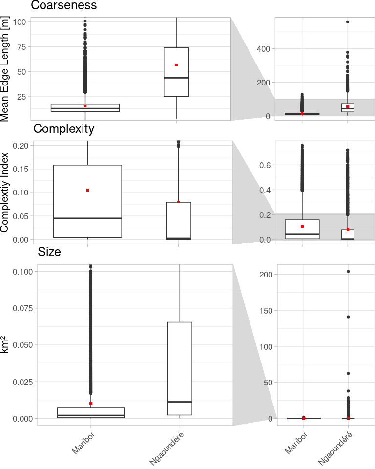
Finally, great! Let’s have the numbers as well for an informed interpretation:
| name | median_Maribor | mean_Maribor | median_Ngaoundéré | mean_Ngaoundéré |
|---|---|---|---|---|
| coarseness | 12.621 | 14.860 | 43.569 | 56.887 |
| complexity | 0.045 | 0.105 | 0.002 | 0.079 |
| obj_size | 0.002 | 0.010 | 0.011 | 0.554 |
In the geometric evaluation it appears that the polygons (remember: mostly imported) in Ngaoundéré are generally bigger, drawn with less detail and, probably as a result, less complex. Even though both regions are shaped by small scale agriculture, it seems that in Maribor this fragmentation of the landscape is better represented in OSM.
Contributors
But there are so many more indicators, what about the mappers of these objects?
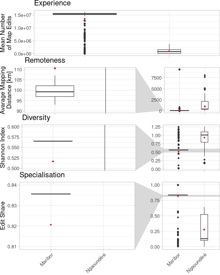
The regions differ, but not only on a geometrical basis. In numbers:
| name | median_Maribor | mean_Maribor | median_Ngaoundéré | mean_Ngaoundéré |
|---|---|---|---|---|
| user_diversity | 0.565 | 0.516 | 1.009 | 0.931 |
| user_mean_exp | 15423648.000 | 13624181.724 | 835810.500 | 970824.977 |
| user_remoteness | 99.241 | 110.572 | 427.582 | 1013.249 |
| user_specialisation | 0.836 | 0.821 | 0.131 | 0.276 |
The import really becomes visible in Maribor with this highly specialised, highly local and highly experienced (in the definition of direct object edit count) user base. But the small variance in the data is doubtful. It seems like a single user created nearly all data in Maribor. An additional indicator may give us more hints.
Community Size
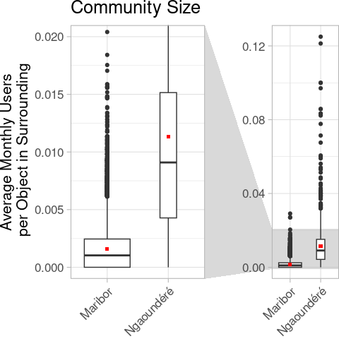
And yes, as expected, the community, expressed by the number of users per element in the surrounding of the analysed elements, is an order of magnitude smaller.
| name | median_Maribor | mean_Maribor | median_Ngaoundéré | mean_Ngaoundéré |
|---|---|---|---|---|
| how_many_eyes | 0.001 | 0.002 | 0.009 | 0.011 |
This can of course be an artifact of the smaller object size and therefore a higher number of objects in the surroundings. Seeing the contributor analyses, it points in the same direction. In fact 78% of all edits in the Maribor dataset were made by the dedicated import account gvil_import.
More Data!
As in use case 1, we still have many more indicators:
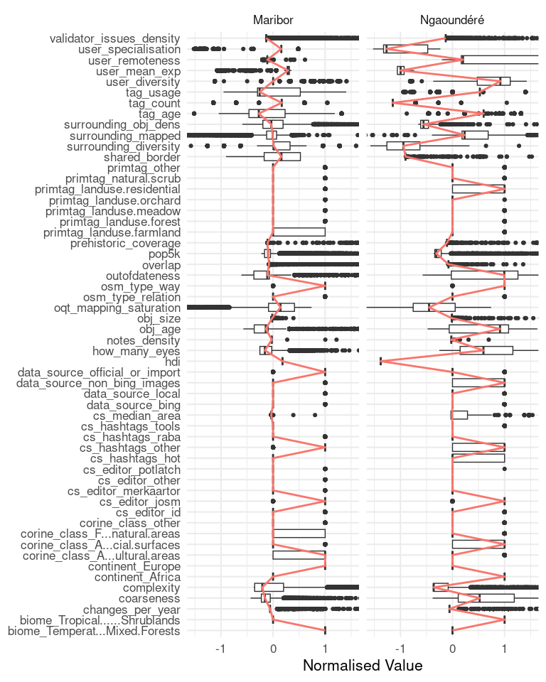
Some of this data is a duplication of data we already have and only makes sense for a global heterogeneous dataset. For example the location of Maribor, in Europe, and Nagoundéré, in Africa. But other differences may spark our interest. For example we noted in the beginning that the data in Cameroon is only suspected to be from an import. In fact, if an information about the source of the data was given, ‘maxar’ or other satellite image providers will mostly be credited, therefore we still cannot prove that an import from other sources occurred here. Also note the object age difference between the two datasets. The import in Ngoundéré seems to have happened earlier (roughly six years ago in comparison to Maribor nearly two years ago).
Conclusion and Outlook
The presented example can be a good starting point for further, more specialised analyses. The raw data would for example allow to confirm or challenge the findings of the multiple studies made regarding the impact of imports e.g. by Witt et al., 2021 or Juhász and Hochmair, 2018. Or the attributes regarding the mapping process like the editor used or the Changeset area will certainly be different for imported data and data sourced otherwise. But for this example we have created supporting evidence for the findings from the clustering analyses in our previous paper: Imports create a markable data structure2.
The analysis presented here could as well be used from a different perspective: as import-users both are presumably outstanding with respect to the number of objects edited as well as to the thematic domain of the imported objects we might be able to identify (undeclared) imports based on the indicators shown here.
1 In an alternative investigation we could of course select random elements from a population and do statistical comparisons, as was done in this article.
2 To really prove this claim, we would of course need to do more analyses and compare the data from similar regions with and without imported data. But that’s also for another time.