

After introducing the OSM Element Vectorisation Tool last week, we now want to show possible use cases and specific examples of what the tool can do. This third and last example will look at the correlations between indicators. The goal is to first assure that the indicators measure distinct data attributes and then search for interesting or surprising correlations that happen nevertheless. This is similar to the correlation analyses made in our research paper but a bit more explorative. We will again use the data from Heidelberg as in example 1. This of course means that all our findings are only valid within that area but on the other hand enables us to potentially unveil region specific data aspects. Please visit the repository for detailed information.
Data
To reproduce this example, download the precomputed data for Heidelberg and convert them to GeoPackages as described in the README. Otherwise, just scroll along. For an overview of the exact implementation for the different data aspects, please refer to the documentation.
Overview
As we have seen in the first example, normalisation is a key aspect of data analyses. We use the same normalisation procedure as the dataset itself provides, but tweak it to use region specific parameters. Based on that an all-to-all correlation is calculated.
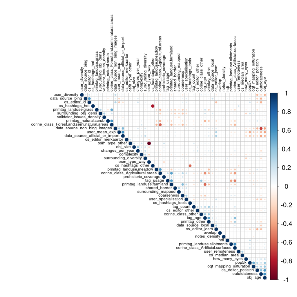
Figure 1: Correlation matrix of indicators in Heidelberg.
From a developers point of view, this honestly looks great. Its mostly blank meaning that each indicator does in fact measure a distinct data aspect. We would have been happy to accept a very low significance level but due to the large data size (8,838 elements) all correlations (or their lack) are highly significant (p-value < 0.01). But there are some correlations, so lets dive deeper.
Strong Correlations
| order | indicator_x | indicator_y | correlation |
|---|---|---|---|
| 1 | osm_type_way | osm_type_other | -1.000 |
| 2 | cs_hashtags_hot | cs_hashtags_other | -0.816 |
| 3 | outofdateness | data_source_non_bing_images | -0.681 |
| 4 | primtag_landuse.allotments | corine_class_Artificial.surfaces | 0.625 |
| 5 | user_mean_exp | data_source_official_or_import | 0.625 |
| 6 | outofdateness | obj_age | 0.609 |
| 7 | corine_class_Forest.and.semi.natural.areas | corine_class_Agricultural.areas | -0.608 |
| 8 | primtag_natural.scrub | corine_class_Forest.and.semi.natural.areas | 0.590 |
| 9 | cs_hashtags_tools | cs_hashtags_other | -0.577 |
| 10 | tag_age | primtag_landuse.farmland | -0.572 |
There are some obvious candidates in the strongest ten correlations that we want to filter because the correlation occurs due to the calculation or the normalisation process rather than the data itself. For example the OSM type. The dataset only contains polygons. Polygons in OSM are generated through ways or relations wherefore any element in our sample will either be a way or a relation. We use a normalisation process that only keeps the most frequent categories in the categorical variables and assigns a lump-group of ‘other’ to the rest before transforming them to one-hot dummy variables. Relations are rather rare, so the normalising process puts all relations in the lump-class ‘other’. Meaning all elements in the dataset are either ‘osm_type_way’ or ‘osm_type_other’ which results in a perfect (inverse) correlation. Similarly, the cs_hashtag attributes correlate with each other because the lump class ‘cs_hashtags_other’ is the inverse of all other hashtag classes. So if any hashtags were given during mapping and they do not fall into a specific category (e.g. HOT or ‘tools’) they are put into the ‘other’ group. So we will filter these correlations as well.
Another correlation that stems from the workflow itself is the ‘primtag’ and the ‘corine_class’ as the latter is defined based on the former. The CORINE class represents a different, more logical, grouping of OSM tags. For example the tags ‘landuse=residential’ and ‘landuse=forest’ have no semantic grouping by themselves. It is only our human knowledge and interpretation that can separate them into a built-up and a forest category. By mapping them to different CORINE classes, namely ‘built-up areas’ and ‘forests’, this categorisation becomes graspable for a machine but results in a positive correlation between the two. And, of course, the limitation mentioned for the OSM type above again plays a role: every element has only one single CORINE class so there will be a negative correlation between different CORINE classes due to the one-hot dummy encoding where each element can only fall into one CORINE class.
The same is true for a third logical link between the folksonomy and the OSM primary tag: The OSM Element Vectorisation Tool directly provides the folksonomy of the tags. Yet, the folksonomy (like the tag age or tag usage) is of course directly bound to the tag itself. We will therefore ignore these correlations and their propagation as well1.

| order | indicator_x | indicator_y | correlation |
|---|---|---|---|
| 1 | outofdateness | data_source_non_bing_images | -0.681 |
| 2 | user_mean_exp | data_source_official_or_import | 0.625 |
| 3 | outofdateness | obj_age | 0.609 |
| 4 | data_source_bing | cs_editor_id | 0.569 |
| 5 | obj_age | cs_editor_potlatch | 0.563 |
| 6 | pop5k | oqt_mapping_saturation | 0.494 |
| 7 | data_source_non_bing_images | data_source_official_or_import | 0.443 |
| 8 | coarseness | primtag_landuse.farmland | 0.438 |
| 9 | outofdateness | cs_editor_potlatch | 0.423 |
| 10 | obj_age | data_source_non_bing_images | -0.416 |
The ten strongest attribute correlations in Heidelberg land-use and land-cover data after filtering processing-related correlations.
This is some interesting data. Next step: visualisation!
Visualisation
Out-of-dateness
Let’s start with the out-of-dateness that accounts for three major intrinsic correlations.
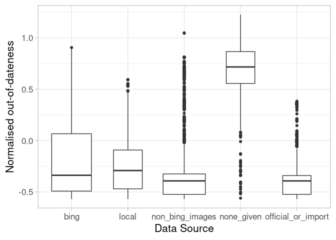
Figure 2: Out-of-dateness by data source given in Changesets or source-tag. Objects can have multiple sources.
The correlation table saw a negative correlation between the time since the last change and the presence of a non-Bing-image source. The median time since the last change is smaller for elements that have this source given, compared to objects with the data source Bing. Bing is a long standing supporter of OSM and its imagery has been used by mappers for a long time now. In contrast, providers like Maxar or Mapbox have only recently made their imagery available. Therefore non-Bing providers can indicate a more recent data source. Interestingly, local map edits done by surveys or mapathons seem to become less common, recently. The median last edit time-stamp for them is even higher.
The category of official and imported data is mostly filled with elements derived from ‘maps4bw’. So while this source shows a map of the official cadastre, these could also be seen as ‘non-Bing’ images. It is therefore mostly not imported data which would form a more ‘concise’ boxplot shape as we have seen in example 2 because all of these elements would be created in a very short time period. Objects without data-source information tend to be even more out-of-date suggesting that it is now common practice to provide the data source.
But the out-of-dateness also correlates with other indicators:
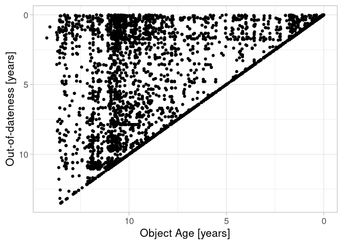
Figure 3: Out-of-dateness in relation to data age. 0,0 (right, top!) marks the analyses timestamp.
The object age defines a natural upper limit for the out-of-dateness which explains the correlation. But additionally we can see that there have been points in time where many elements were created (vertically arranged points) or updated (horizontally arranged points).
Figure 4: Out-of-dateness by editor given in Changesets. Objects can have been edited with multiple editors.
The OSM ecosystem is always evolving. And so are the tools mappers use to edit the data. It all started with Potlatch which is still used today but has been mostly replaced by ID or JOSM. This also explains the correlation to the object age. New tools (in the ‘other’ category) like MAPS.ME (MapsWithMe), detailed offline maps of the world for iPhone, iPad, Android or StreetComplete have also been introduced recently. The few objects that do not provide any information on the editor seem to have persisted from the early days of OSM.
The Editor
The default settings of editors have an influence on the mapping behaviour, especially for novice mappers. ID uses Bing aerial imagery as the default background, explaining the correlation between the two.
Figure 5: Occurences of sources by editor used. The size of the bubbles represents the numer of elements in each category. The size of the circles depicts the expected number of elements in this category according to the column and row sums. The color signifies the relation between the count and the expectation (bubbles and circles): red signifies less than expect, yellow shows an equilibrium and blues depict an ‘overabundance’.
But looking at the data we can also see that JOSM has a positive relation to official and imported data in OSM. While ID seems to ensure credit to the source is given, Potlatch does (or did) not.
Figure 6: Data source given in relation to the user experience.
Non-Bing images and local information are used by more experienced mappers. But the use of official data and imports is often done by very experienced users. For imports this is clear, as we have seen in example 2. But in Heidelberg, there were less imports and more official data. But this data, namely maps4bw, is locally limited and seemingly most known among experienced mappers. This may also explain the correlation between the two data sources non-Bing and official-and-import as they may be used by the same mappers, potentially within the same mapping session.
OQT
Correlation six is eye candy for any OSM data analyst. This relation between the completeness and the population density has often been hypothesised and sometimes been proven. But we have to be careful. There is a potential that OQTs method to estimate completeness is biased towards areas with a higher count of elements. Further analyses and testing should be done here.
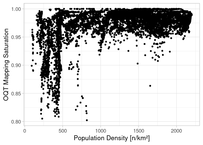
Figure 7: Relation between the population density and the mapping saturation predicted by OQT.
Coarseness
The tenth strongest correlation between the elements drawing detail and farmlands are naturally given. Fields and arable land are, together with forests (which are only few elements in Heidelberg and therefore fell into the ‘other’ group), some of the largest elements of a landscape. In addition, they often have a regular shape that permits large distances between vertices of the polygons, the so called coarseness. Grass elements, that are often used for urban green like traffic islands, roundabouts or embankments on the other hand are a topic for so-called micro-mapping.
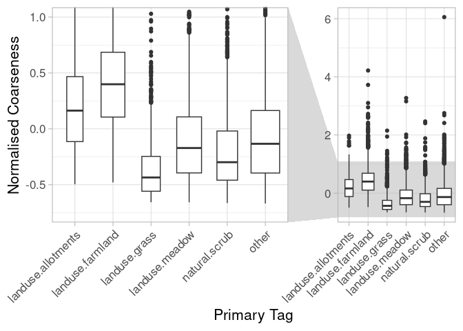
Figure 8: Coarseness of elements depending on their primary tag.
Weak Correlations
The tool presents us with a “free” dataset. This means we can also look at data that does not promise great new insights. In this case, the least correlated indicators:
| order | indicator_x | indicator_y | correlation |
|---|---|---|---|
| 1 | cs_hashtags_other | primtag_landuse.grass | 0.000 |
| 2 | cs_editor_josm | cs_editor_merkaartor | 0.000 |
| 3 | user_remoteness | user_specialisation | 0.000 |
| 4 | oqt_mapping_saturation | cs_hashtags_other | 0.000 |
| 5 | shared_border | cs_hashtags_tools | 0.000 |
| 6 | cs_median_area | cs_hashtags_hot | 0.000 |
| 7 | obj_size | cs_hashtags_tools | 0.000 |
| 8 | cs_editor_merkaartor | primtag_landuse.meadow | 0.000 |
| 9 | cs_hashtags_hot | cs_hashtags_tools | 0.000 |
| 10 | shared_border | cs_hashtags_other | 0.001 |
So there are some indicators which have no association at all. Most of them relate to hashtags. This is because only 38 elements in Heidelberg are associated to a specific hashtag. The same is true for the editor Merkaartor, that occurred seldomly. But the third non-correlation seems interesting.
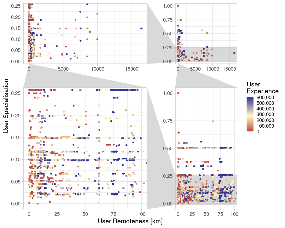
Figure 9: User Specialisation (the share of elements edited by a user in the same semantical group as the element itself) and User Remoteness (median distance of user Changeset centroids to the element centroid). The top right shows the raw data, the bottom left a zoomed in version.
There are many very local mappers in Heidelberg. But there seem to be only three categories: mappers that are specialised and local, mappers that are specialised and local and mappers that are unspecialised and remote. As the fourth category (remote and specialise) is missing, there is no (linear) correlation. But even in the zoomed area the data looks more like a burst cushion. And interestingly from a visual perspective this does not seem to be due to their experience. So there don’t seem to be any specialists, assuming they exist, coming from other areas and visiting Heidelberg. Yet, all three indicators have to be compared with caution. While the user specialisation is limited to the object creator, the remoteness and the experience represent a summary over all mappers that touched the element.
Conclusion and Outlook
The tool has once again proven to be handy to better understand the dataset. Continuing the presented analyses in different regions or more representative samples will help us to further understand the current state of OSM and monitor future developments.
1 ‘tag_usage’ and ‘corine_class’ both depend on ‘primtag’ wherefore ‘tag_usage’ and ‘corine_class’ have a natural correlation.